Originally published on July 27, 2012
The Bureau of Economic Analysis (BEA) released new US real GDP data today. They released both the first estimate (called the ‘advance estimate’ to emphasize that they are using “incomplete source data”) for the second quarter of 2012 as well as revised estimates for 2009 through the first quarter of 2012 as part of their “regular annual revision of the national income and product accounts (NIPAs)”. Unlike the last two years, this year’s revised estimates weren’t particularly surprising. So, we can be comforted by knowing that although the US economy looks to be as bad as we thought, at least it’s not worse. Similarly, the estimate for US real GDP growth in the second quarter, although pretty sluggish (just 1.5 percent at an annual rate), was about what economists were expecting.
Since there doesn’t seem to be much new news to write about, and the “accuracy-timeliness tradeoff” of macroeconomic data releases just isn’t firing me up today (although, for those interested, here’s a presentation from a related talk I did in June), I thought I’d write about a different data series today. It’s US real GDP per capita. We don’t look at this number too often in the US, but a reporter friend of mine asked me about it today, so I took a look, and now I think it deserves more attention than it’s getting.
Here’s a graph to consider:
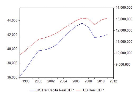
The top red line is annual US real GDP (in 2005 chained dollars on the right axis). The lower blue line is annual US real GDP (in 2005 chained dollars) per capita (on the left axis). The key thing to note is that both series peaked in 2007 and then dropped during the Great Recession of 2007-2009. By 2011, US real GDP had returned to where it was in 2007 (and, although hard to tell by the scale of the graph, has now slightly surpassed the peak). The per capita measure, however, is still well below its peak in 2007. The problem is that the US population grows about 1% per year, and US real GDP hasn’t kept pace with that in the recovery. I think the per capita measure gives us a better sense of the tepid recovery and emphasizes what US households are feeling. I’ll be keeping a closer watch on this number in the future.